
Why burgundy feels right again
By Catherine, Co-Founder of The Living House - online interior designers based in the UK, with 35 years of combined design experience
Every autumn, there is a point when the light changes. The evenings begin a little earlier, lamps are switched on before dinner and the cooler colours that felt so easy in summer suddenly need something warmer beside them. This year, that something is burgundy.
After spending many years out of favour, burgundy is finding its way back into our homes. But it has left behind the heavy, overly co-ordinated rooms we may remember. Now it is being used in crisp stripes, geometric borders, small-scale patterns, glossy modern furniture and beautifully decorative details. It still feels warm and enveloping, but the effect is fresher, lighter and far less formal.
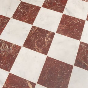
Better still, it is a colour you can use at almost any scale. A burgundy tea towel can give a pale kitchen a small seasonal lift. A sculptural side table can anchor a sitting room. At the other end of the scale, a burgundy and cream marble checkerboard floor can make an unforgettable first impression.
What colour is burgundy?
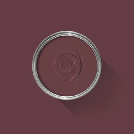
Burgundy is a deep red with brown or purple undertones. Its name comes from wine, and many of the other names used for this family of colours have the same delicious quality: merlot, claret, oxblood, black cherry, mulberry, damson, plum, aubergine, cranberry, wild cherry and raspberry. It sounds less like a paint chart and more like a very good shopping list.
The names are useful, but they are not exact. One brand’s burgundy may be another’s merlot. Claret often appears a little redder, oxblood browner and darker, while plum and aubergine lean further towards purple. Mulberry and raspberry tend to bring in more pink.
This is why the sample matters more than the label. Before choosing paint, fabric or stone, look at the colour alongside the fixed elements already in your room. A brown-based burgundy may settle beautifully next to walnut and warm stone, while a blue-based berry tone may feel cleaner beside pink, pale blue or cooler marble.
Why are burgundy interiors having a moment?
For several years, grey and pale neutrals did much of the work in our homes. They brought calm, but they could also leave a room feeling a little too quiet. Burgundy answers the growing appetite for interiors with more warmth, depth and personality, without the brightness of a true red.
It also has a useful ability to connect old and new. We associate wine-red shades with painted dining rooms, patterned china, antique rugs and polished wood, yet burgundy looks just as convincing on a clean, sculptural piece of furniture. The curved H&M Home side table is a perfect example: the colour softens its strong outline, while the glossy finish stops it feeling traditional.
That tension is what makes burgundy interesting now. It can bring weight to a modern room and energy to a more traditional one.
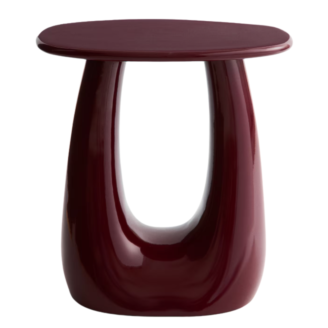
H&M Metal Side Table in Burgundy, £149.99
How do you make burgundy feel fresh rather than dated?
The difference lies in the company it keeps. Burgundy can feel heavy when every element in a room has the same depth, finish and period. Give it contrast and it becomes much more alive.
1. Add a pale or unexpected colour
Cream and oatmeal will soften burgundy, but they are not the only options. Powder blue gives it a crisp, contemporary lift. Chalky pink creates a gentler tonal scheme. Olive green, ochre and caramel emphasise its autumn warmth, while a sharper raspberry or clear red can make it feel more playful.
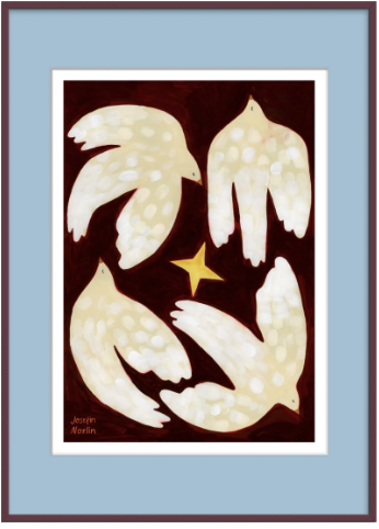
Dancing Around The Star Plum Frame, £96, The Poster Club
2. Use stripes and geometry
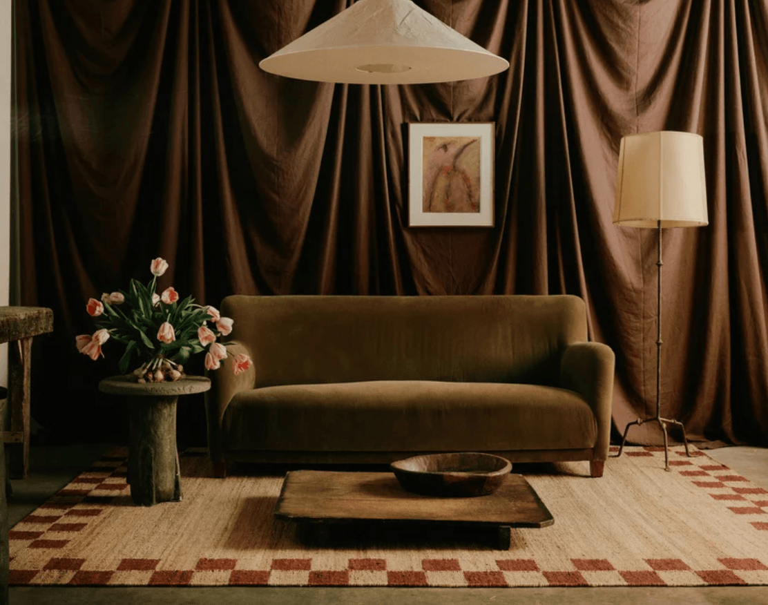
A broad stripe on a lampshade, a checkerboard border on a rug or a simple repeat on a cushion gives burgundy a clean framework. Geometric pattern is especially effective because it balances the colour’s historic associations with a stronger, more graphic rhythm.
You do not need every pattern to match. A stripe can sit very happily beside a small floral or an abstract weave when they share one or two related colours and the scales are noticeably different.
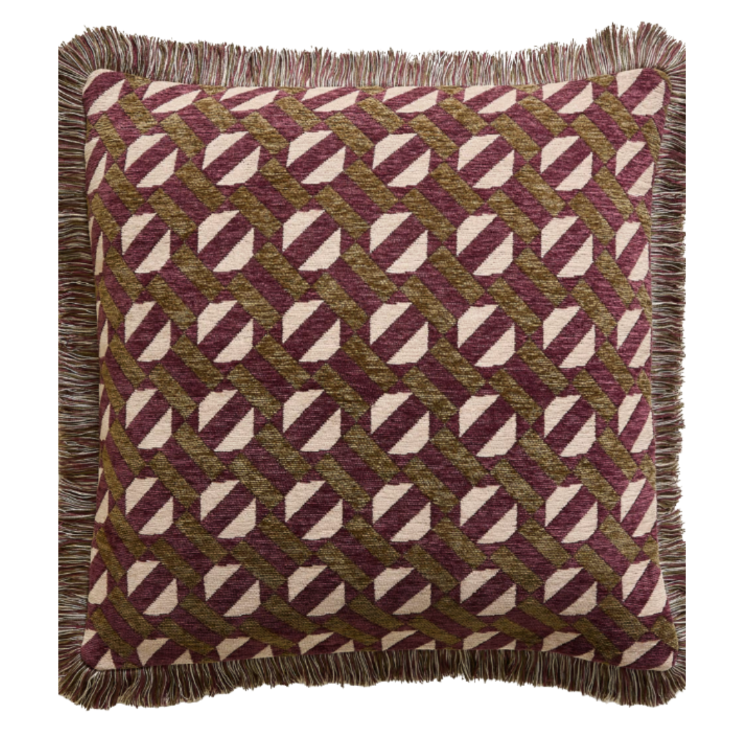
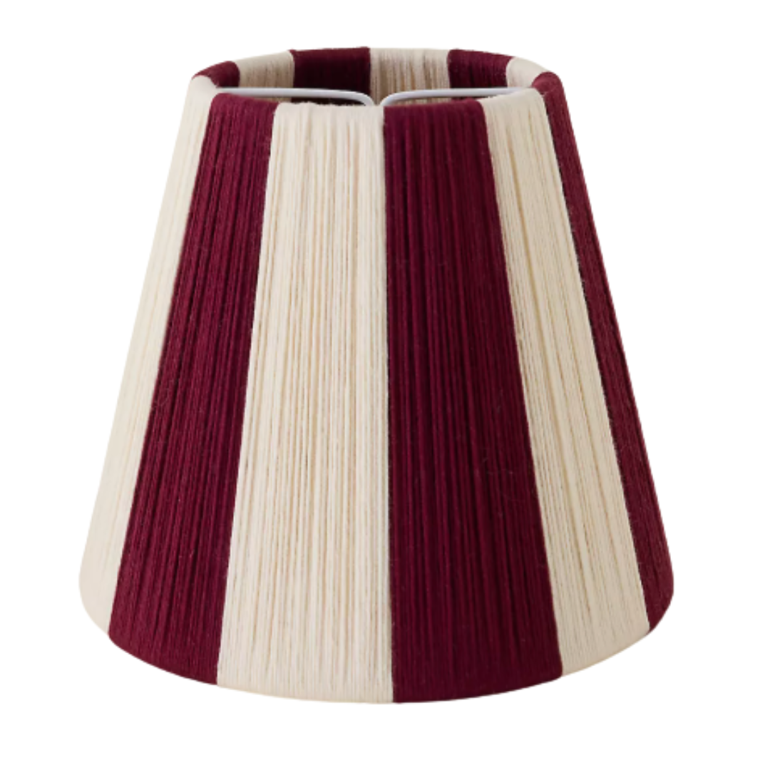
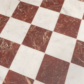
Marks & Spencer Chenille Geometric Tile Cushion in Moss, £30, Anthropologie Loving String Tiny Empire Lamp Shade in Wine, £95, Quorn Stone Riviera Burgundy Honed Marble Tiles, £114 per sq m
3. Mix the finishes
Burgundy changes character with its material. In washed linen it feels relaxed; in wool it feels grounding; in high-gloss lacquer it becomes bold and modern. Glazed ceramics, painted timber, marble, wicker and velvet each reflect light differently, preventing a tonal scheme from becoming flat.
Try one polished surface beside something dry and textured: a glossy table with a jute rug, for example, or a glazed plate against a softly washed wall.
4. Welcome decorative detail back in
Fringed cushions, contrast piping, bordered rugs, gathered or striped shades, painted bobbin frames and patterned china are all finding a place again. Decorative does not have to mean fussy. One beautifully finished detail, given enough space around it, can make a room feel considered and personal.
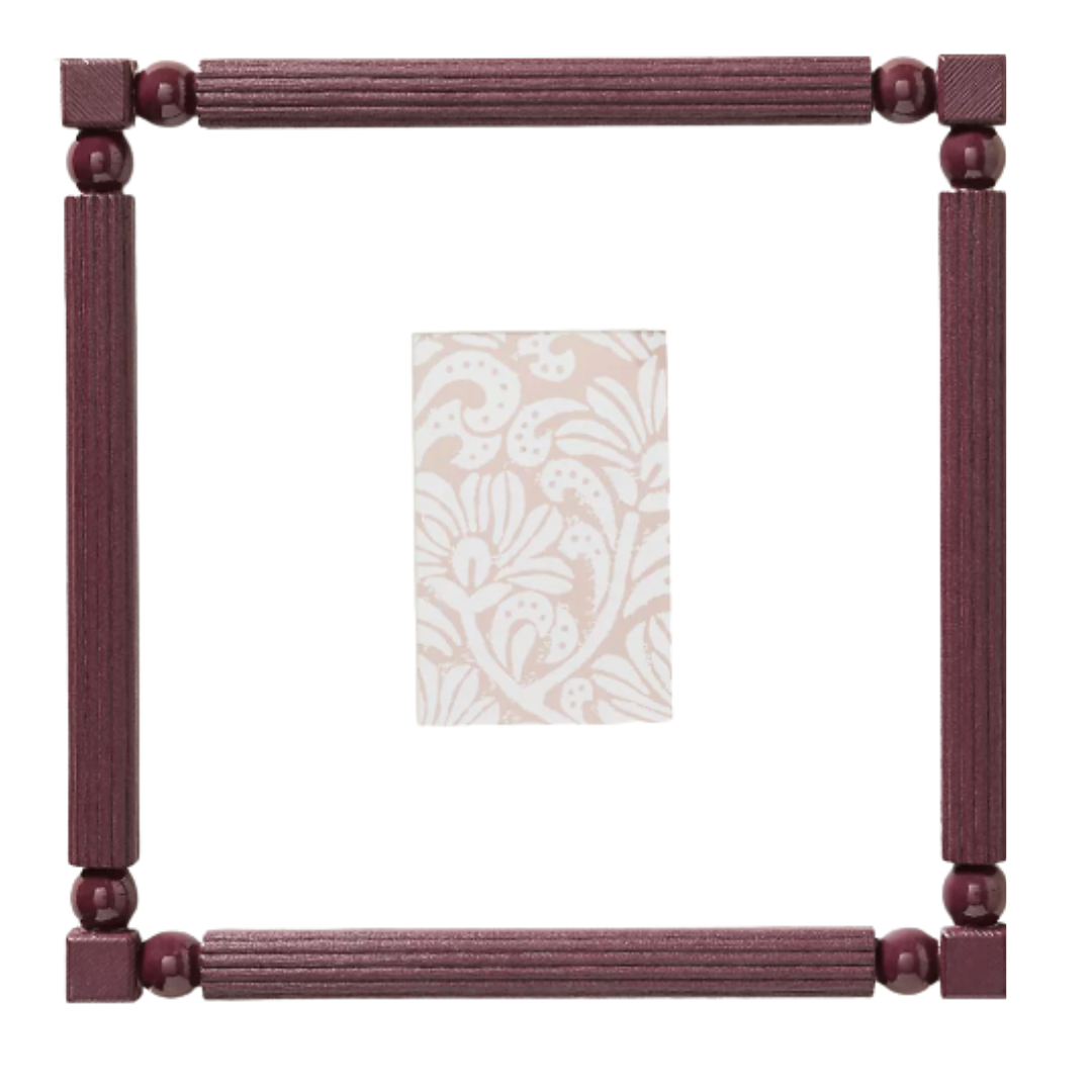
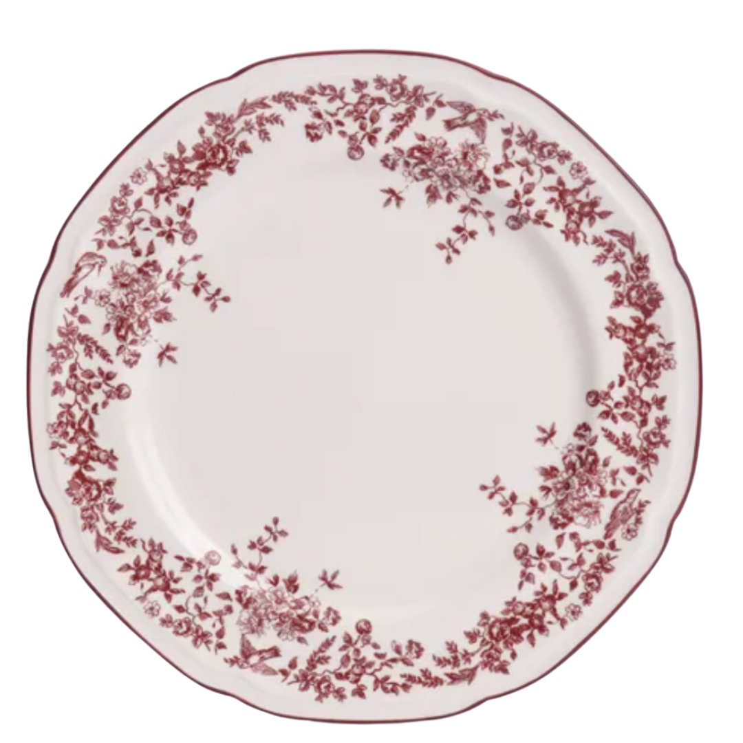
Benedicta Gallery Geometric Resin Photo Frame, £136, Anthropologie, Georgina Side Plate Burgundy, £4, Dunelm
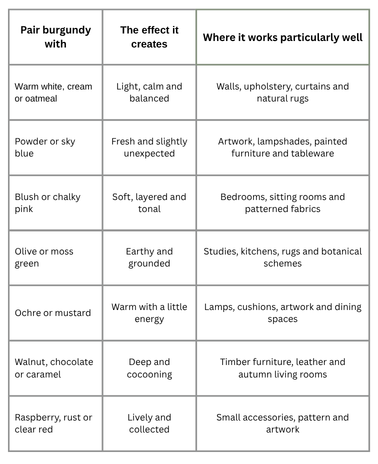
The important point is not to choose all of them. Start with burgundy, one quieter supporting colour and one small note of contrast. That is usually enough to build a room with depth without creating more decisions than you need.
How much burgundy should you use in a room?
Decide first whether burgundy will be an accent, an anchor or the background. Giving the colour a clear role makes every later choice easier.
Start small: use burgundy as an accent
For the lightest touch, introduce it through pieces that are easy to move:
a tea towel or table linen in the kitchen;
a striped lampshade;
a painted frame or small artwork;
a tray, plate or vase;
a cushion with burgundy in the pattern; or
seasonal foliage with deep red leaves.
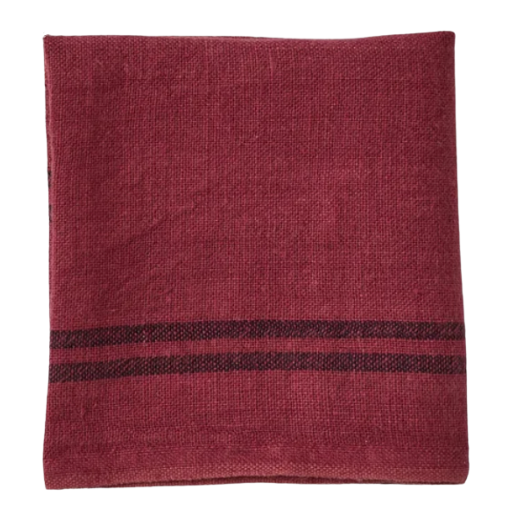

Charvet Linen Tea Towel Russet Red, £25, Toast, Artificial Ruscus in Resin Pot, £40, Marks and Spencer
One small piece can look accidental, so echo the colour once or twice elsewhere in the room. The repeats do not need to match exactly. In fact, a slightly lighter raspberry or deeper aubergine will usually make the scheme feel more natural.
Take the middle ground: choose one anchoring piece
A bordered rug, occasional chair, table lamp or sculptural side table gives burgundy more presence without asking it to dominate. Choose one main piece, then add two quieter echoes at different heights: perhaps a burgundy detail underfoot, a related shade in a cushion and a narrow line of colour in a lampshade.
This approach is particularly useful in a neutral room that already has good furniture but lacks focus. You are not replacing everything; you are giving the eye somewhere to settle.
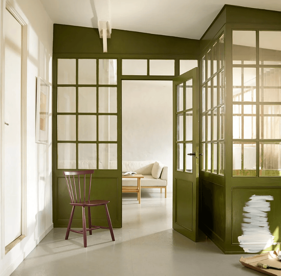
West Wing Burgundy Chair J46, £189
Commit fully: make burgundy part of the architecture
Used across walls, joinery or flooring, burgundy can be wonderfully absorbing. It suits rooms that come alive in the evening, such as dining rooms, snug sitting rooms and small cloakrooms, but it can also work in a bright kitchen when balanced by pale stone and natural light.
A burgundy and warm-white marble checkerboard floor is a confident version of the idea. The pale squares hold the light, while the repeating geometry keeps the richer stone feeling crisp. Because flooring affects the whole room, choose the exact slabs and grout colour in person and view them with the kitchen or wall finishes before committing.
Does burgundy make a room look dark?
Not automatically. Dark colours reduce reflected light, but that does not mean every room needs to be made to look as bright as possible. In a space used mainly in the evening, a deeper colour can create exactly the welcome you want.
If you would prefer to keep things lighter, place burgundy below eye level in a rug, ottoman or side table, then use warm white or a pale colour on the walls. A glossy finish on a small item will also catch the light. In a darker room, good layered lighting matters: combine a ceiling or wall light with lamps at different heights rather than relying on one bright source.
Always test painted samples through the day. Burgundy can move from red to brown or purple as the light changes, and the right version is the one that works in your room, not simply the one that looked best online.
Can burgundy work beyond autumn?
Yes. Its autumn character comes largely from the colours and textures around it. Pair burgundy with moss, ochre, dark wood and heavy wool and it will feel deeply seasonal. Put the same colour beside powder blue, soft pink, fresh green, pale linen or a crisp stripe and it carries comfortably into spring and summer.
That makes burgundy more useful than a passing seasonal accent. Choose a tone you genuinely enjoy and it can become part of the lasting palette of your home.
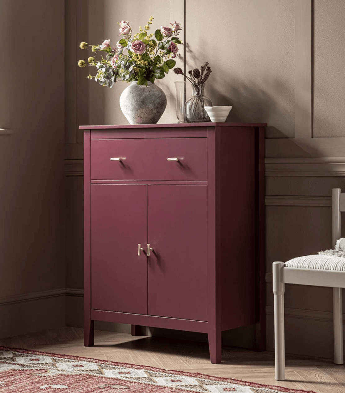
Daals Oakham Small Sideboard with Drawer, Wild Cherry £169.99
A burgundy interiors edit
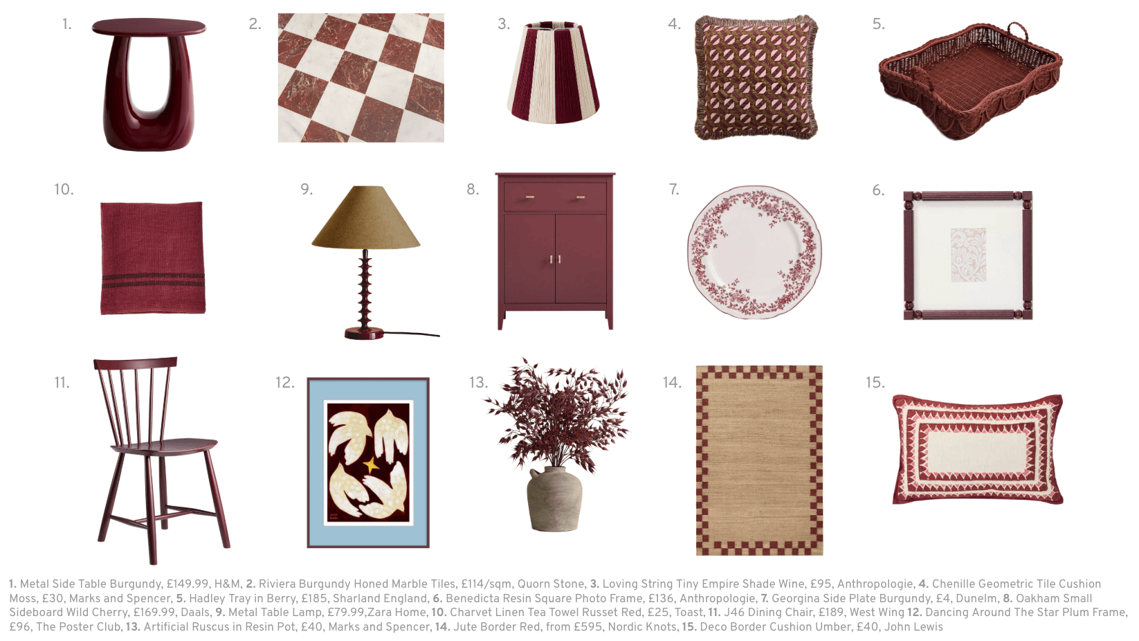
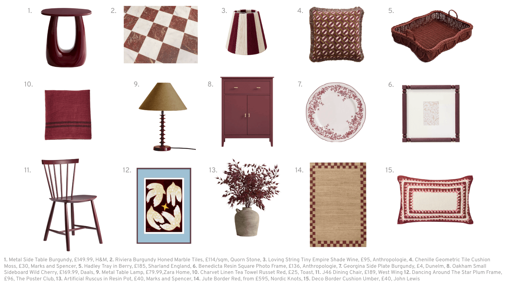
Our burgundy edit shows the full range: a tea towel and patterned plate, striped lighting, bordered rugs, fringed cushions, painted furniture, woven accessories, modern lacquer and that glorious checkerboard marble floor.
The moodboard is a starting point rather than a prescription. Notice which combination catches your eye, then consider the light, scale, existing furniture and everyday life of your own room before buying. Often, one strong piece and two quieter echoes are all that is needed.
Take a look at how we can help you with The Complete Design
Frequently asked questions about burgundy interiors
Is burgundy a warm or cool colour?
Burgundy is usually considered a warm colour because it is based in red, but its undertone can change the effect. Brown-based burgundies feel warmer and earthier; blue- or purple-based versions feel cooler and closer to plum.
What neutral goes best with burgundy?
Warm white, cream, oatmeal and pale taupe are easy partners because they give burgundy room to breathe. Choose a neutral with a compatible undertone and check both samples together in the room’s natural and artificial light.
How can I use burgundy without it looking old-fashioned?
Combine it with a clean shape, graphic stripe or geometric pattern, and vary the materials. Powder blue, pale pink and fresh green also move burgundy away from an overly formal look. Avoid matching every burgundy item exactly.
Is burgundy suitable for a small room?
Yes. Use it as a focused accent if you want to preserve a light feeling, or embrace it on the walls for a more enveloping room. Small cloakrooms, studies and snugs can be very effective places to use a deeper colour confidently.
What is the difference between burgundy, merlot, claret and plum?
There is no universal boundary between these names. Burgundy and merlot generally describe deep wine reds; claret often reads a little clearer and redder; plum contains more purple. Product names vary, so compare physical samples rather than relying on the label alone.

Cinema room combining dark green with burgundy accents for an enveloping feel
The Living House is an online interior design studio helping families transform their homes into spaces that are beautiful, functional, and unmistakably theirs. Browse our services at thelivinghouse.co.uk. Book a free discovery call here to discuss your project!
RELATED BLOGS:



Here at The Living House, we’re so excited to announce the launch of our new service — The Layout Fix. Designed to help solve your room layout challenges!
As interior designers, we know that getting the layout right is one of the most important parts of a successful design. In fact, it’s always where we start because how can you know what’s going to fit, or how a room will function, if the layout hasn’t been nailed down first?