8 paint colours for a south facing room
Written by Sophie Clemson
Choosing the right paint colour for your room isn’t just about the style or look you want to achieve, it's also important to consider which way the room faces, as this can affect how a colour appears and how the space feels.
South facing rooms are often the easiest when it comes to choosing a paint colour, as they benefit from abundant natural light throughout the day. This steady flow of sunlight gives you more flexibility with colour choices. Whether you prefer light, airy tones or deeper, more dramatic hues, a south facing room can handle a wide range of colours, making it a versatile space to design. That said, because of the sheer number of colour options available, choosing the perfect paint can still feel overwhelming.
To help you find the perfect paint colour for your south facing room we have selected eight gorgeous shades from some of our favourite brands that will work beautifully in your south facing room.
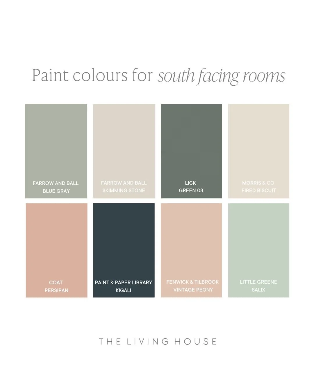
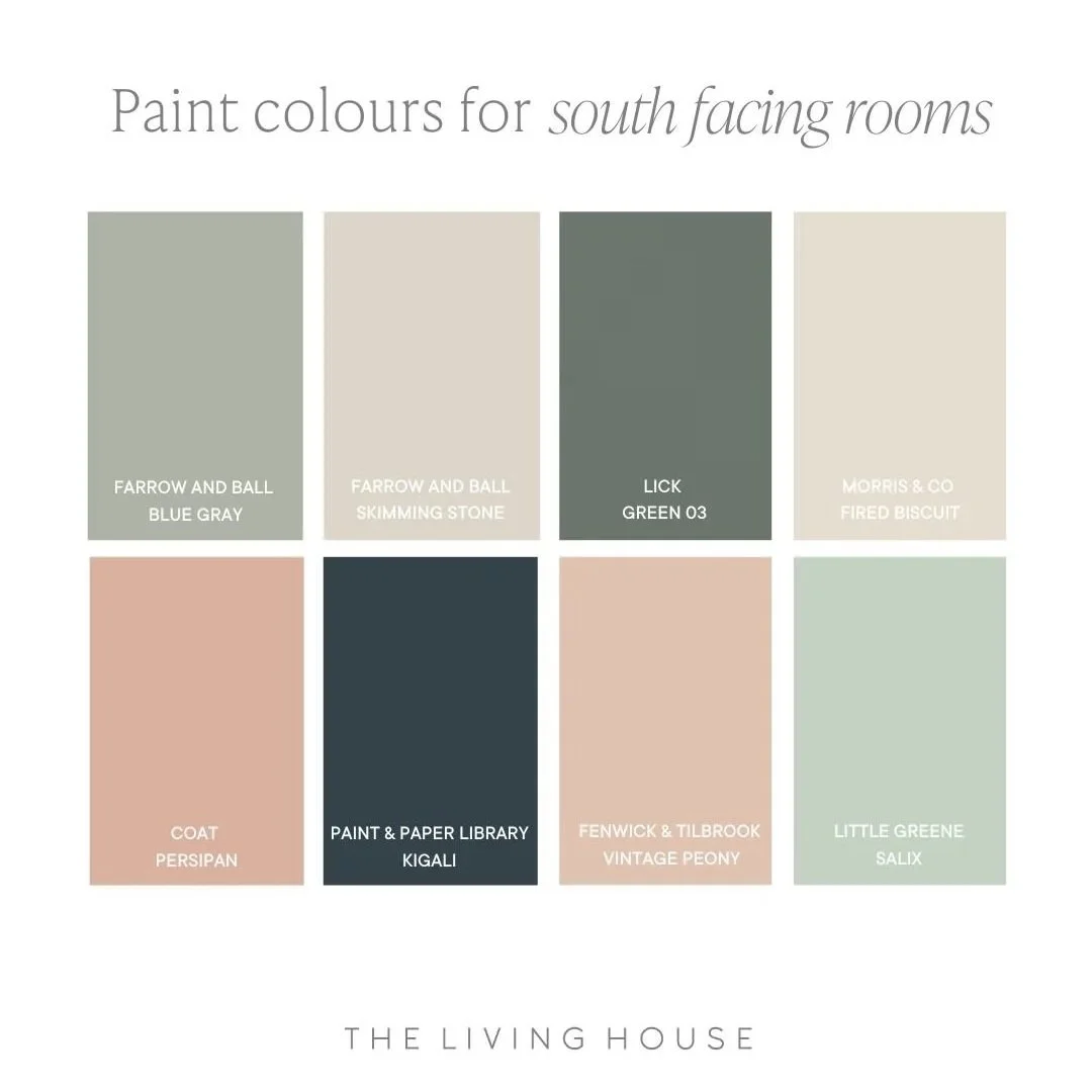
Farrow and Ball - Blue Gray
Farrow and Ball - Skimming Stone
Lick - Green 03
Morris & Co - Fired Biscuit
Coat - Persipan
Paint and Paper Library - Kigali
Fenwick & Tilbrook - Vintage Peony
Little Greene - Salix
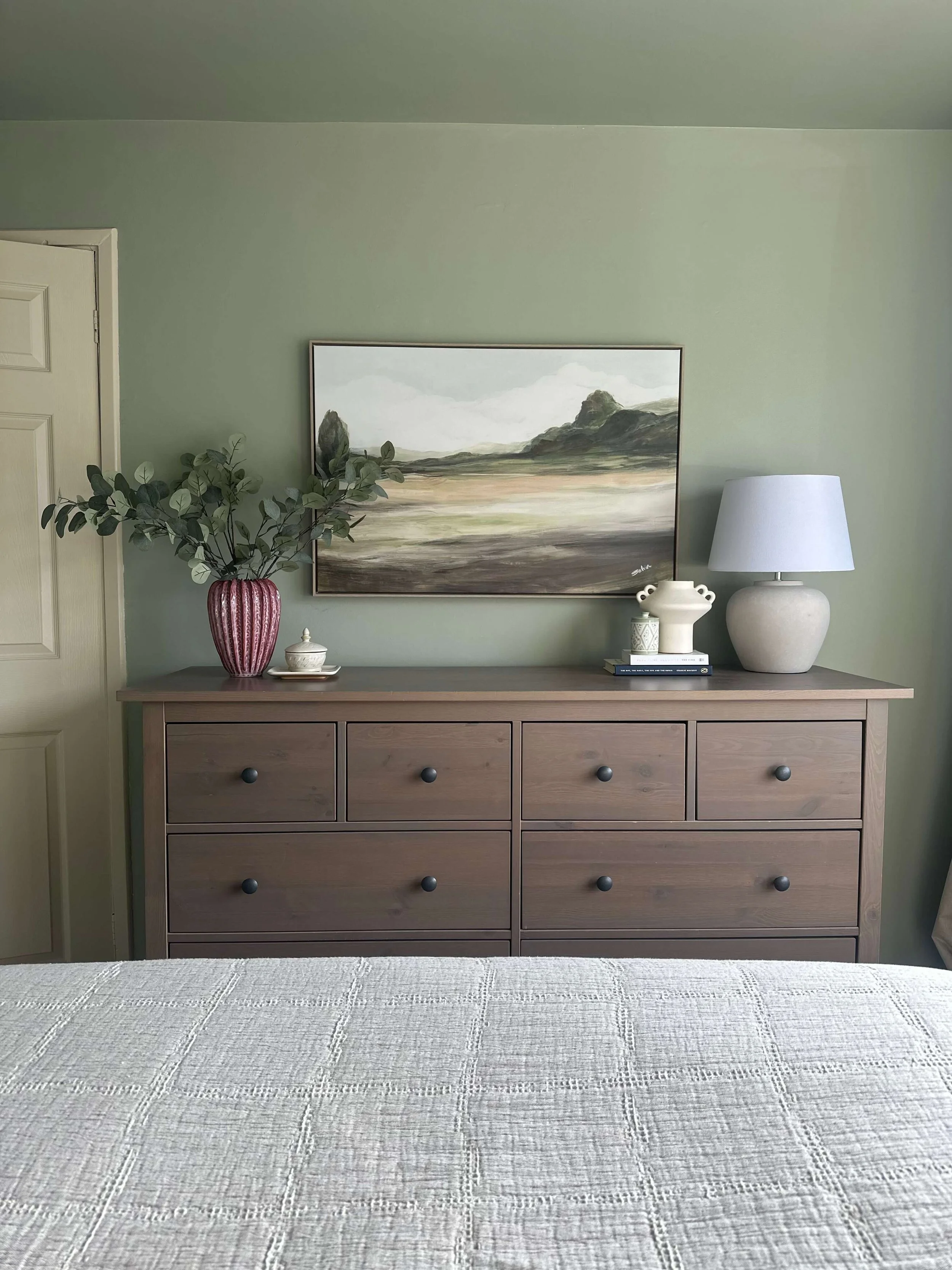
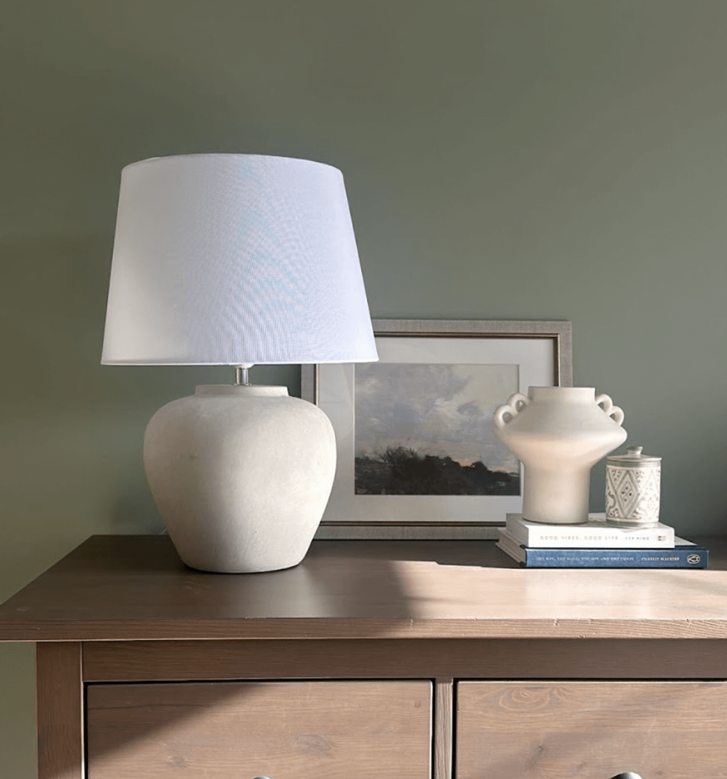
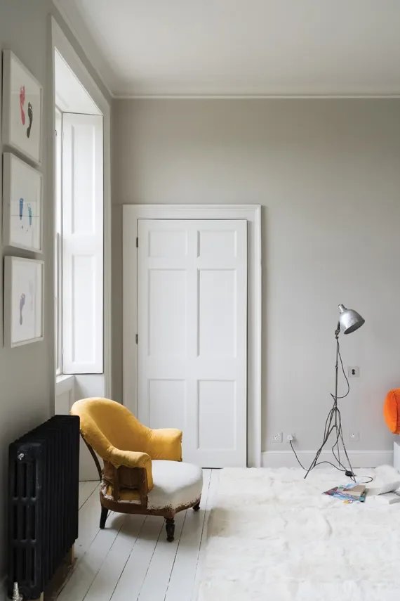
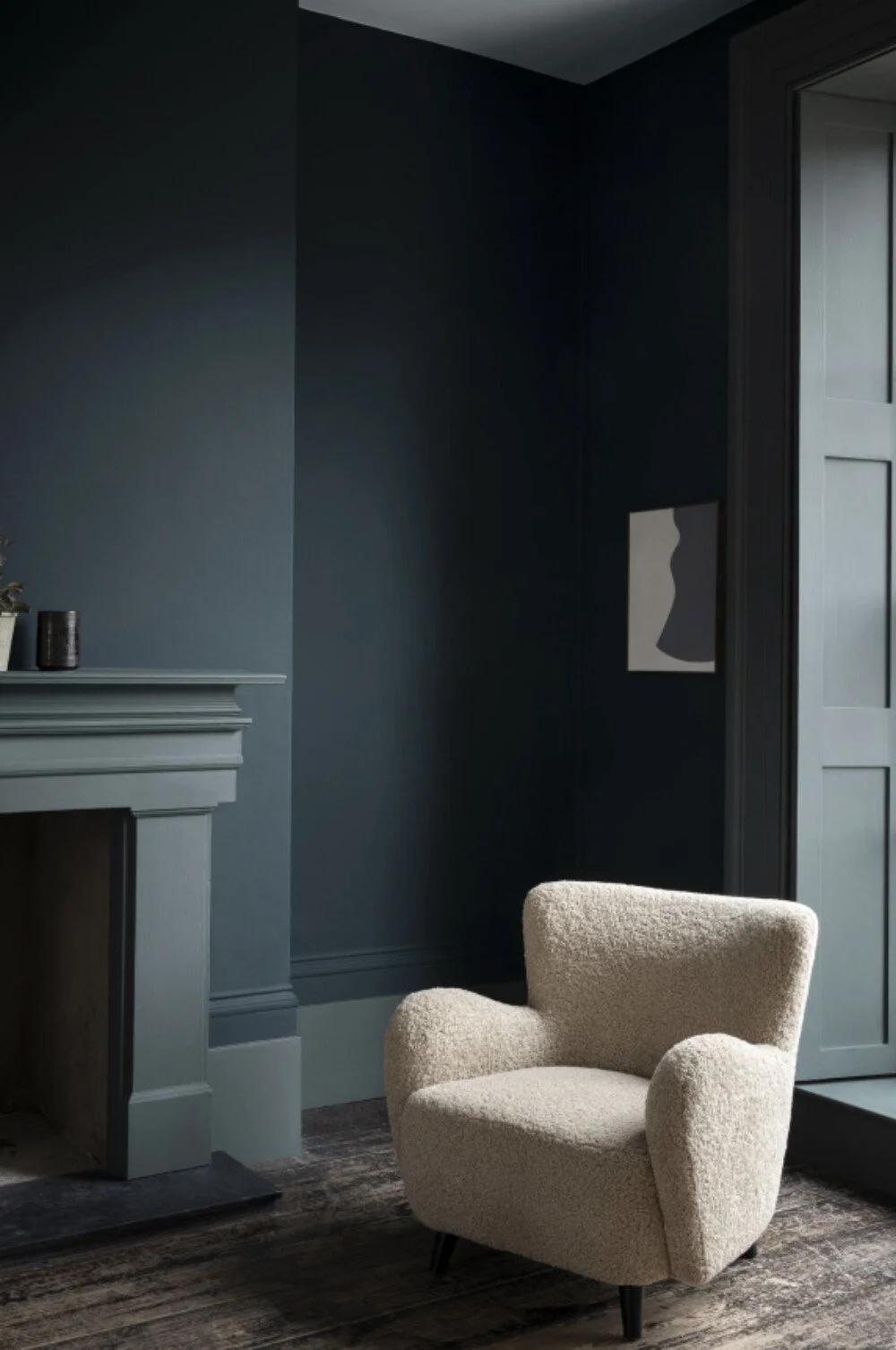
Farrow and Ball - Blue Gray
Blue Gray is a beautiful and intriguing paint colour that can appear more blue or green depending on the time of day. Its cool blue grey tone makes it an excellent choice for south facing rooms, where it can balance the abundant natural light. Sophie has this gorgeous paint colour in her own bedroom which creates the most relaxing space.
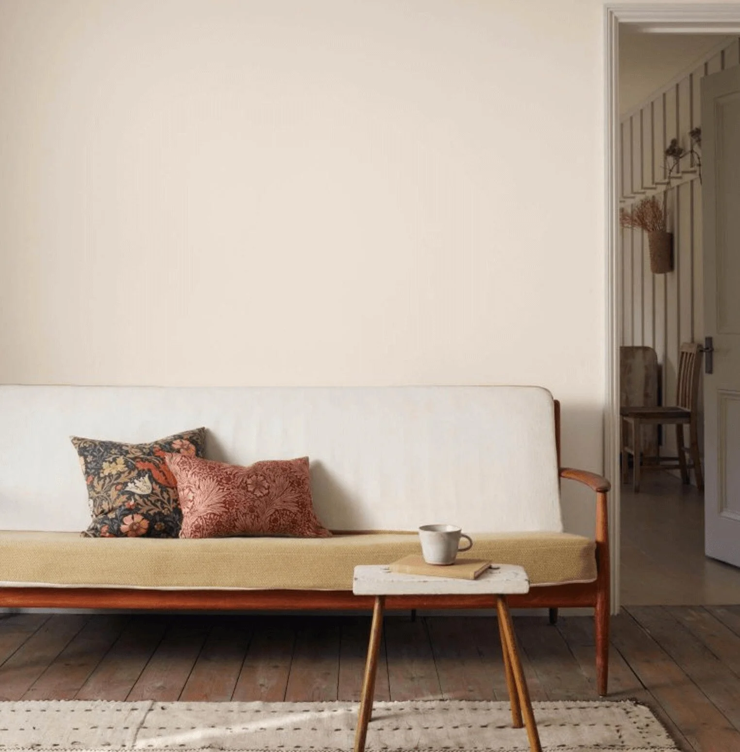
Farrow and Ball - Skimming Stone
Skimming Stone is a warm light grey, it’s a versatile shade thanks to its subtle warm undertones. Its warmth adds depth, allowing it to complement a variety of spaces and pair well with both light and dark accents.
Source: Farrow and Ball
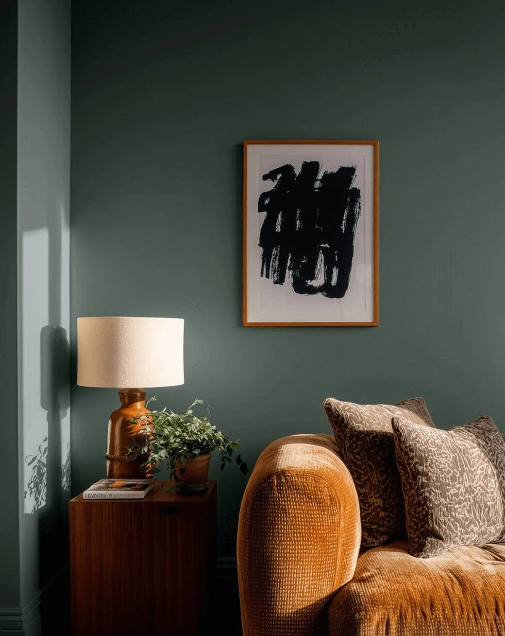
Lick - Green 03
Green 03 is a smoky green with cool blue and black undertones, offering a rich, sophisticated hue that adds both depth and warmth to a room.
Source: Lick
Morris & Co - Fired Biscuit
Fired Biscuit is a gorgeous warm neutral shade. Morris & Co. describe it as the light brownish colour of clay before it’s fired, which we think perfectly captures the essence of this warm, and earthy tone.
Source: Morris & Co.
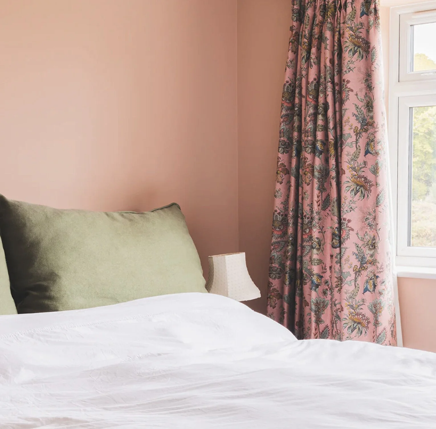
Coat - Persipan
Persipan is a saturated, plastery pink, described by Coat as a 'wet plaster pink.' It’s a rich yet grounded shade that pairs beautifully with other pink tones.
Source: Coat
Paint and Paper Library - Kigali
Kigali is a deep blue, described by Paint and Paper Library as 'blackened denim.' If you're not afraid of going bold and are seeking a dark, moody atmosphere, this could be the perfect colour for you.
Source: Paint and Paper Library
Fenwick & Tilbrook - Vintage Peony
Vintage Peony is a beautiful soft plaster shade by Fenwick & Tilbrook. What’s lovely about this pink paint colour is that it isn’t bright or a sickly shade. It’s a soft, muted pink that would look great in so many rooms, from a kitchen where you want to add an unexpected pop of colour to a child’s bedroom or master bedroom. Its versatility makes it a wonderfully adaptable pink.

Source: Fenwick & Tilbrook (Vintage Peony used above cabinets)
Little Greene - Salix
Salix is a gentle paint colour that works well if you’re looking to create a calming and restful south facing room. Little Greene describes this shade as a “cool silver paint with a touch of green.” If you’d like to introduce a subtle hint of green to your walls, this could be the perfect choice.
Source: Little Greene
Now that you’ve discovered our eight paint colour picks for a south facing room, here are some helpful tips, from how best to test your samples to creating a cohesive look throughout the space.
Always get a tester pot of the paint before you make your decision. No matter how quickly you need to decide, it really is worth taking the time to avoid any costly mistakes.
Paint your sample onto a large piece of lining paper so you can move the piece around the room. That way you can see how it appears as the light changes, and in artificial light too.
Paint the ceiling the same colour as the walls for a cohesive look, especially when using a neutral colour. This has the effect of blurring the edges of the room, creating depth and harmony, and making the room feel larger.
Don't forget the radiators! Paint the radiator the same colour as the walls, especially if you're going for a dark paint colour, to help it blend in and become almost invisible.
Want to know more about The Living House and how we can help you?
RELATED BLOGS: