
Case Study: How One Power Hour Rescued a Family Extension from a Costly Mistake
Written by Catherine Seagrave
Kat in London | Open-Plan Ground Floor Extension | Power Hour with Catherine & Becky
"We couldn't quite put our finger on why it wasn't working - but something felt off."
Kat was at a pivotal point in their renovation. She’d had planning approved for a ground floor extension and their architect had produced a proposed layout. On paper, it ticked many of the boxes: a utility room, a new playroom, an extended kitchen. But every time they looked at the plans, something nagged at them.
"Our concerns were that it would create an overly complex, convoluted journey through the house - and make both the kitchen and playroom feel narrow."
She knew they needed an expert pair of eyes before the builders arrived. So they booked a Power Hour.
The Brief: A Family Home That Actually Works for Family Life
Kat and her husband have young children, bikes, scooters, buggies, sports kits, and all the wonderful chaos that comes with family life. Their existing ground floor had no proper home for any of it - and the architect's proposed layout, while well-intentioned, wasn't solving the problem as well as it could.
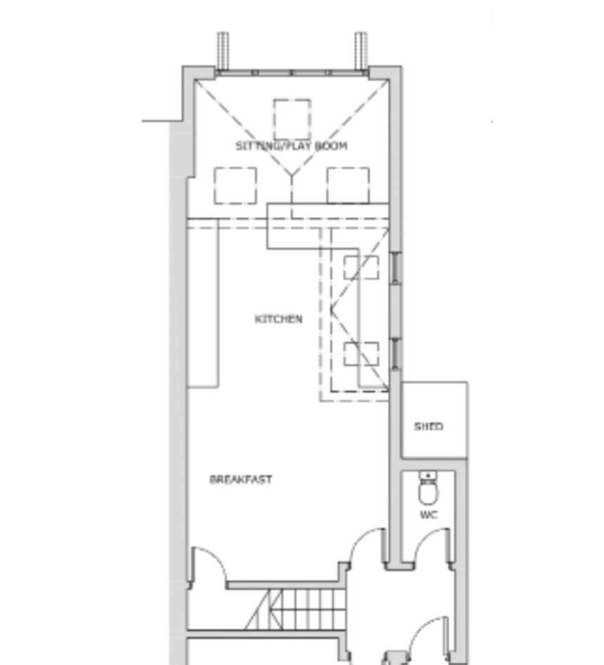
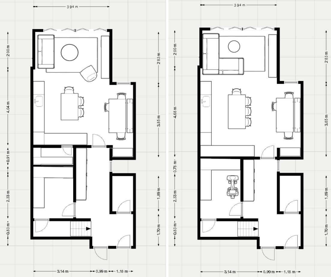
Existing Floorplan
Their key challenges were:
No proper utility space. Coats, shoes, the buggy, the washing machine, mops and hoovers had nowhere to go - meaning clutter was constant.
A dark, uninviting middle section of the house that felt disconnected and unwelcoming.
A kitchen that was too wide and not working efficiently, with a breakfast bar that made the living area feel cramped.
A proposed playroom that would be narrow, awkward to reach, and ultimately too small to function well as a family space.
A convoluted flow - the journey from front door to back of house involved too many turns, too many doors, and too many compromises.
Their vision? Open, light-filled and functional - a home that felt spacious from the moment you walked in, with clear zones for cooking, eating, relaxing and play - and crucially, somewhere to put everything.
What the Architect Had Proposed - and Why It Wasn't Quite Right
The architect's plan stayed close to the approved footprint, which was sensible from a planning and cost perspective. But it created an L-shaped galley kitchen that would feel tight, a utility room that was still too small to be genuinely useful, and a narrow side playroom that compromised the kitchen, was oddly positioned and difficult to furnish well.
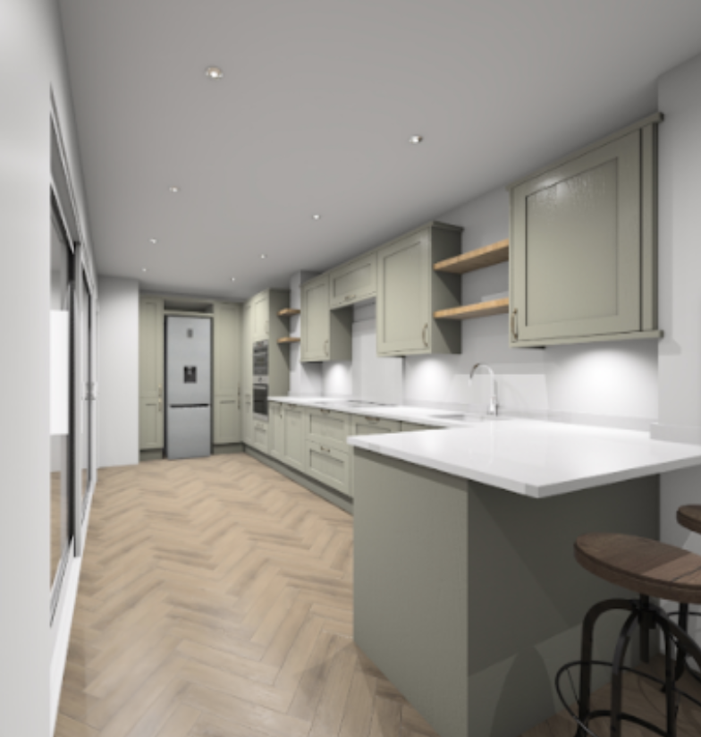
Narrow kitchen design
The route through the house had become a maze of doors. Light was being cut off. The utility, the main selling point of the whole redesign, wasn't generous enough to actually fix the storage problem.
As Catherine explained during the session: "I think you can do better."
Find out exactly how we can transform your home.
Book your free discovery call here.
The Power Hour: Fresh Eyes, Immediate Clarity
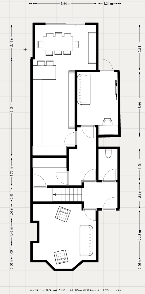
Within the first twenty minutes of the call, Catherine and Becky had loaded the plans into their floorplanning software and begun exploring what the space could really offer.
Their central insight was simple but powerful: rather than carving the back of the house into separate competing rooms, they proposed opening it up entirely - a wide, flowing kitchen-dining-living space - and doubling the size of the utility room to create a genuinely hard-working behind-the-scenes zone.
Here's what the proposed redesign looked like:
A properly generous utility room. Not just a cupboard with a washing machine in it - a room large enough for laundry appliances, the buggy, scooters, bikes, mops, and yes, even the exercise bike that had been living in the front room. When life's mess has a real home, everything else gets to feel calm.
A boot room-style hallway. Floor-to-ceiling cupboards running along the hall wall, with bench seating, coat hooks and shoe storage positioned as close to the front door as possible. As Catherine noted: "The further away the shoes and bags go from the front door, the less likely they are to make it there." This immediately gave the entrance the breathing space it had always lacked.
An open-plan kitchen, dining and living space that flows, with a clear sightline through from the kitchen door all the way to the garden. A large island with seating for four. A dining area neatly tucked into the new extension, where bench seating could provide additional hidden storage. A relaxed sitting and play zone at the back with a media wall for toy storage now and screens later.
No dividing walls. Zones without barriers. They had always wondered whether they needed a physical separation between kitchen and play space. The redesign showed them they didn't - that good storage, thoughtful furniture placement, and defined zones could do all the work without shrinking the rooms.
The WC, boiler, fuse boxes and structural walls all stayed exactly where they were. No unnecessary replumbing. No structural upheaval. Just a smarter use of the footprint that had already been approved.
The Moment It Clicked
Kat’s husband's response said it all: "I like it. It flows. I can see that it flows really nicely."
Kat, who admitted she usually takes a week to warm up to new ideas, found herself on board almost immediately: "I really love that the corridor hallway feels less wiggly. I've been really struggling with the idea of coming into the house, taking a left, a right, another left, another right - and this is just nice and simple."
The couple also realised something they hadn't fully articulated before: they already had a separate living room at the front of the house. The back didn't need to be a second formal room - it needed to be a brilliant, flexible family space. The front room could become the grown-up snug or playroom as the children grew. The whole brief quietly shifted from "how do we divide this space?" to "how do we make the most of it?"
Catherine and Becky also suggested an oriel window in the dining area - a projecting bay window that would bring in extra light, create a charming nook, and add a design moment to what would otherwise be a plain external wall. The kind of detail that elevates a renovation from functional to genuinely beautiful.
Problems Solved
By the end of the session, every one of the original challenges had a solution:
Storage - in abundance, across multiple zones: utility, hallway, understair cupboard, dining nook, island and media wall
Flow - a clear, logical journey from front door through to garden, with a wow-factor sightline on entry
Light - skylights retained, new window in the dining area, bifolds at the back flooding the space with light
Defined areas - kitchen, dining and living/play clearly zoned without a single dividing wall
Cost management - structural walls, WC, boiler and fuse boxes all remain in place
What Came Next
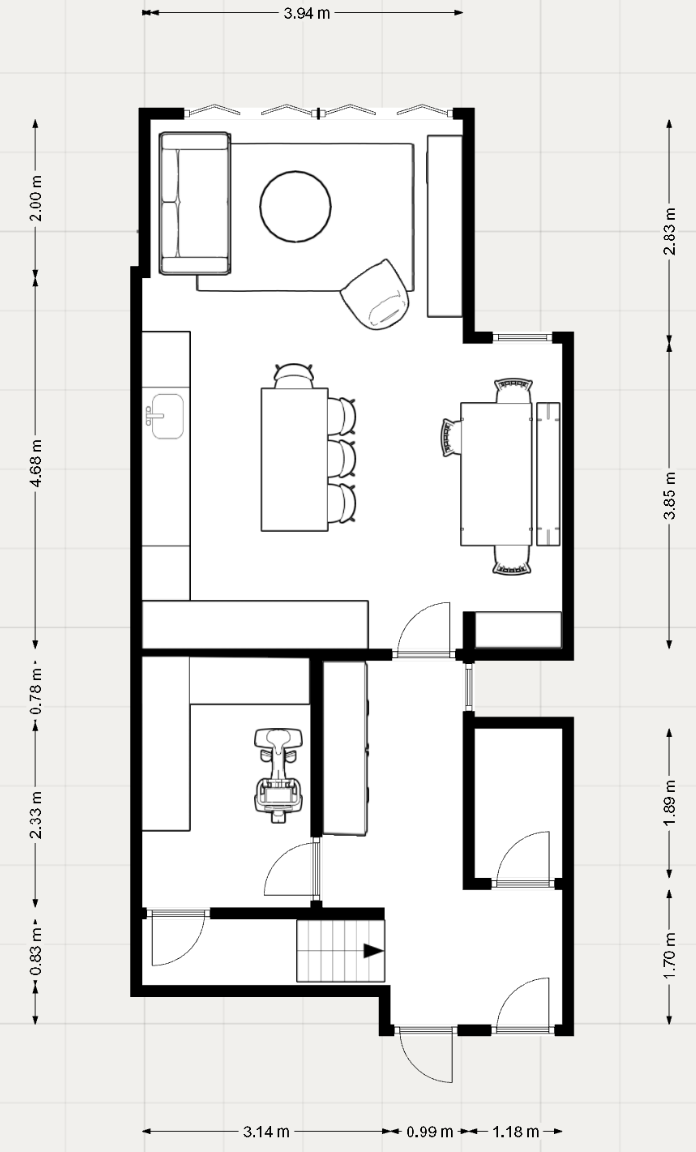
Catherine and Becky shared the updated floorplans - including furniture sizes - so Kat could take the proposal to their kitchen designer and builders with something concrete in hand. Three layout variations were included: the primary open-plan version, an alternative with a hidden pantry accessed through a secret cupboard door, and a version with a corner sofa for those who prefer a little more visual separation in the living zone.
Kat left the call with complete clarity - and the confidence that their renovation was heading in exactly the right direction.
What Kat Said Afterwards
Following the session, Kat left this review on Trustpilot:
"I had a brilliant experience with the team! I'm so thankful we set up a Power Hour with them early enough in our renovation to be able to completely revise the proposed floorplan. They probably rescued our renovation from being a complete disappointment! After seeing their proposal, my husband and I are finally on the same page after months of feeling we were compromising and I'm confident we can now get everything we want from our home. The discussion was direct and practical, and the team really understand how a family uses a home and bake that into the design. The whole process was professional and slick with clear outcomes and next steps. I'll definitely be using them for the full design package when we are in the build stage."
★★★★★ — Kat, Trustpilot
Could Your Extension Do with a Fresh Perspective?
If you've got an architect's plans but something doesn't quite feel right - or you're investing in a renovation and want to make sure you get it right the first time - the Power Hour is exactly what you need.
One hour. Two expert designers. Complete clarity.
RELATED BLOGS:


