
Choosing the Best Dark Paint Colours for Your Home
Written by Catherine Seagrave
Dark interiors are rich, bold and amazingly dramatic - but also really scary to use in your own home, right? Wrong!! Use them in the right way and they are surprisingly easy to pull off. Follow our guide and you can confidently transform your room into the cocooning, cosy space of your dreams!!
A dark interior can feel like a warm hug, giving an enveloping cosiness that white walls can just never achieve. White and bright can feel cold and soulless, and we are definitely seeing a move towards colours that are more atmospheric and dynamic. Colour is the backdrop to our everyday lives and plays a huge role in how we feel in our homes. Almost every customer we speak to tells us they want their home to feel warm, cosy and welcoming - and we do too! Your home is your sanctuary, your escape from the outside world, and you want to create that sense of intimacy and comfort.
The benefits of a dark paint colour
To help you overcome the fear of a dark moody interior, there are some real benefits to painting your walls a bold inky shade;
A rich bold colour works with many different interior styles. It can transform a mid century modern living room, create a cohesive look for a boho bedroom, and looks equally at home in a sleek contemporary kitchen
A dark backdrop makes other colours ‘pop’. A bright piece of artwork against a dark blue wall is going to shine far more than against a pale beige wall
Dark walls are a fabulous blank canvas to accentuate everything else in your room. It creates high contrast and excitement, accentuating lighter coloured furniture
Painting the ceiling the same colour as the walls will make the ceiling appear higher - no really it will!! We are all quite stuck on the idea of a white ceiling making the room feel bigger and brighter (it could be a blog in it’s own right!) but this isn’t always true. Think of the ceiling as your 5th wall. If the colour is a stark contrast to the walls, it draws your attention to it as a hard edge. If you paint it the same colour as the walls the edges blur and it is hard to tell where the wall ends and the ceiling begins. This blur pushes the ceiling into the background, giving the illusion of a higher ceiling
A dark colour can be practical. It can hide imperfections and is more friendly to the daily knocks and scuffs of family life and our beloved pets!
And of course, it brings warmth, drama and sophistication in spades.
@1930sarang

@an_irish_homelife
But which colour to choose?
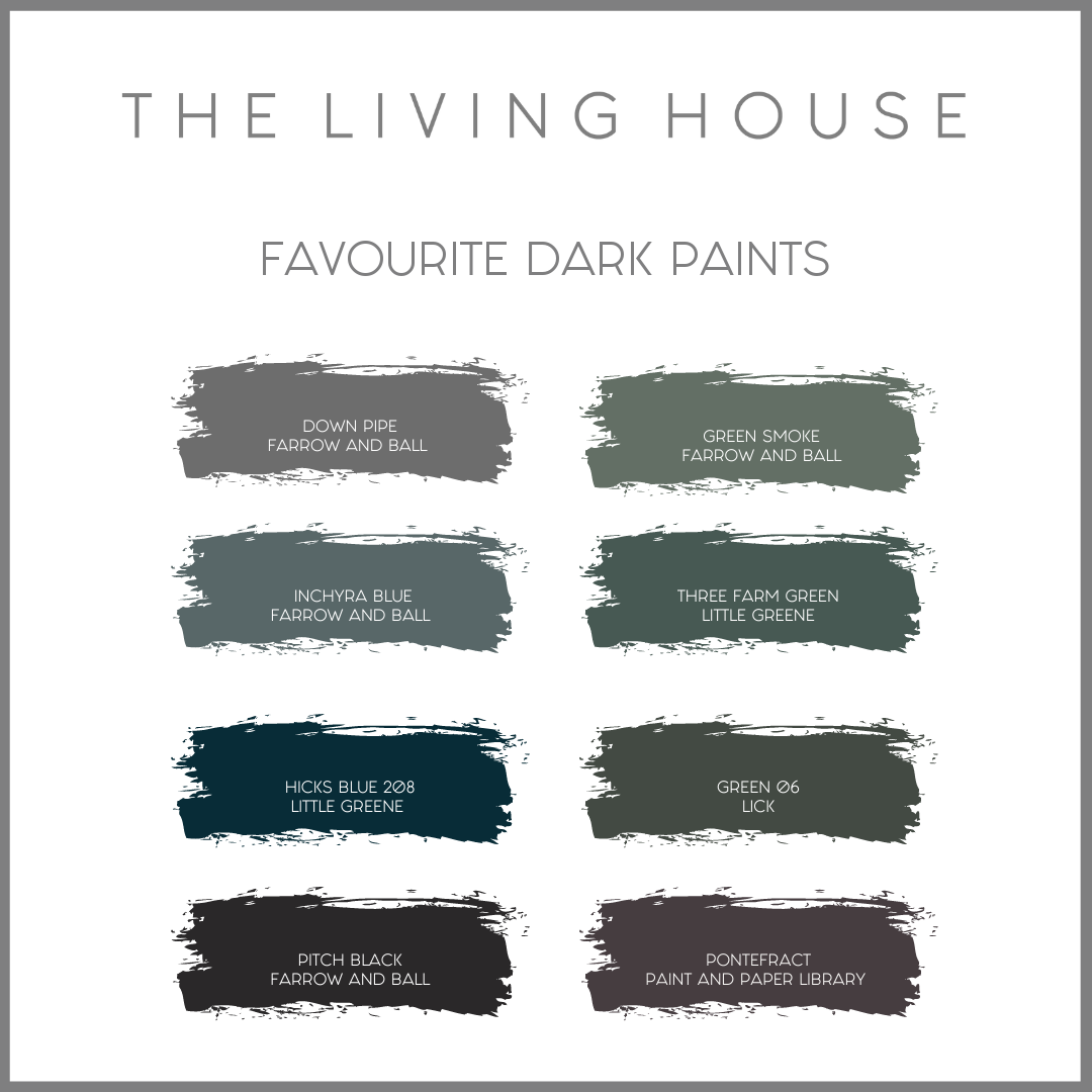
We are spoilt for choice with paint shades but sometimes that can feel overwhelming! Thankfully we have narrowed it down to 8 of our favourites for you.
Dark greens feel relaxing and are beautiful with natural wood tones. Dark blues can feel sophisticated and in rooms with more natural light, the blue can really shine through. Dark blue is dramatic on it’s own, but team it with a white and it can feel surprisingly fresh. Charcoal greys look great with everything and can easily be mixed with wood, gold tones, and lighter painted woodwork.
Green Smoke 47, Farrow & Ball - An all time favourite, ‘Green Smoke feels lived-in and familiar in the best way’. It has a softness to the colour that is easy to live with, whilst still having just enough depth to make a statement.

@ohmyedwardian
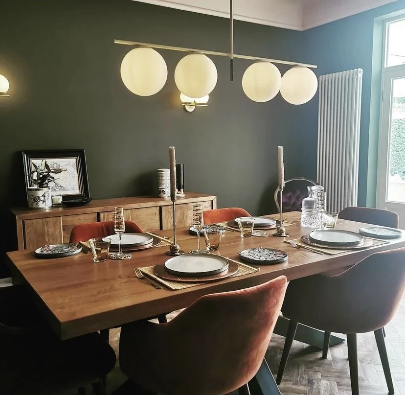
Three Farm Green 306, Little Greene - A deeper green with a leaning towards blue. We loved pairing this colour with rich mustard and the natural finish of rattan for a customer. A beautiful colour!

Green 06, Lick - ‘Imagine a darker-than-dark green, creating depth, drama and decadence’. A bold dark green that would give amazing contrast to everything else in your room.

@perfecting_the_house
Hicks Blue 208, Little Greene - An inky dramatic blue, ready to introduce pops of bright colour to bring it alive!

@edwardian_vignette
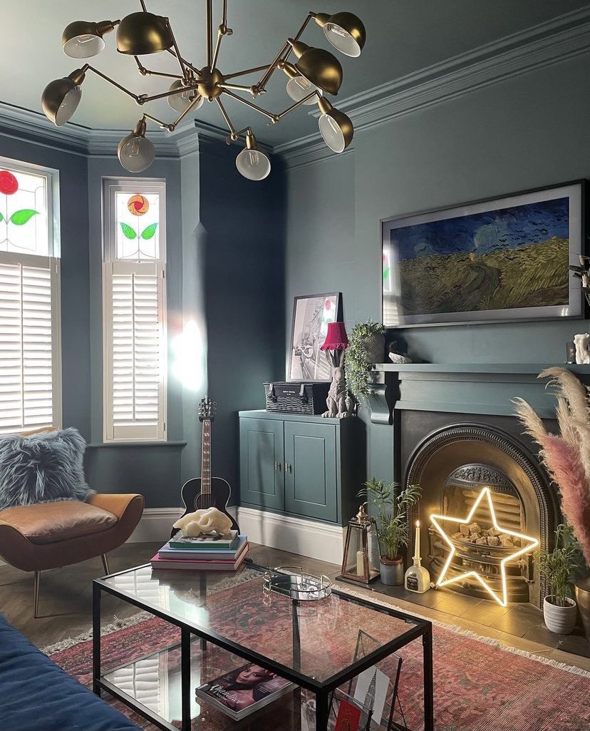
Inchyra Blue 290, Farrow & Ball - This is Farrow & Ball at it’s best with a colour that can read as grey, blue or green in different lights. Inspired by the shifting colours of the dramatic Scottish skies it creates a dark and intimate space.
@dark_revelry
Pontefract, Paint and Paper Library - An unusual colour, Pontefract has visibly pink undertones, creating an elegant colour with lots of warmth. Looks beautiful against stone and marble.

@houseofnebu
Downpipe 26, Farrow & Ball - With it’s definite blue undertones, this daringly dark hue creates a wonderful background for artwork. A colour from humble beginnings, (literally guttering and downpipes!) it’s a great choice for a contemporary home.

@my_midcenturymakeover
Want to discuss your options? Book a free discovery call with us today!
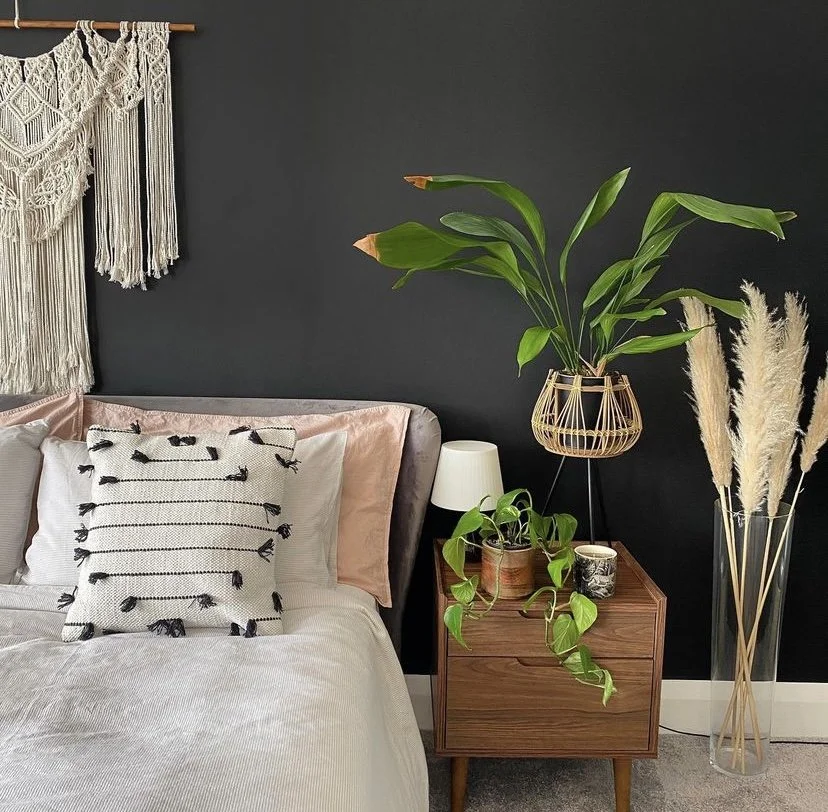
Pitch Black 256, Farrow & Ball - If you are feeling daring, this is the colour for you! A true black, it is strong and uncomplicated in all lights. The depth of colour gives it an almost velvet finish. Beautiful.
@maisonmilshaw
Trade Secrets - how to make it work!
Hopefully we’ve convinced you that a dark paint colour is an inspiring and beautiful choice. Follow these tips to make sure you get it absolutely right in your home!
Always, always, always get a sample pot. Even if you are completely convinced on a colour, take the time to try it in your room before you commit. Paint can look very different in different lights and at different times of the day, And it reacts to colours you may already have in the room - carpet and furniture. Paint as large a piece of lining paper as you can and move it around the room and look at it in daylight and artificial light. Try a few similar shades to see how they look before you get the roller out!
Try colour drenching where you paint the walls, ceiling and woodwork in the same shade. It creates a cohesive, saturated and enveloping look - and best of all, there’s no fiddly cutting in around all the edges!!
If you have a smaller space, try painting large furniture in the room the same colour as the walls. This works well with wardrobes, or built in shelving and makes the room feel less cluttered as the large pieces disappear into the background.
Paint radiators the same colour as the wall to make them disappear too.
Do add lighter blocks of colour. You’re not trying to create a cave after all! Contrast the dark walls with lighter rugs or a neutral sofa for a focal point.
Mirrors and good lighting will bring the colour to life. Enhance the light you have in the room by bouncing it around with a large mirror, and in the evening add layers of lighting to make the room feel cosy and inviting.
If you have any questions about using dark colours in your home, get in touch! We know that designing a room can be daunting, and we’d love to help you. With personalised help and advice, you could be transforming your room in no time!