
The top interior design mistakes we see - and how you can avoid them - part 1
Written by Catherine Seagrave
No one wants to get it wrong when it comes to updating their home. It’s costly and demoralising. It’s definitely not what you set out to achieve and yet when we meet new customers, we often get asked ‘why doesn’t this room work?’, ‘why doesn’t it look how I imagined?’ and ‘what’s wrong with it??!’.
You may have done your research, browsed home magazines and pinned the best of Houzz. You feel inspired after watching Design Masters on TV (new series starting next week!!), and so you start buying. You have an idea and you feel excited - but then it all arrives and somehow it just doesn’t work. It’s not the room of your dreams. But why?
It may be that you have fallen foul of some of the interior design mistakes that we see time and again. So today we’re going to highlight some of the pitfalls, and give you a few things to keep in mind to help you achieve the right kind of design drama in your home!
Don’t paint the ceiling pure brilliant white
But everyone has a white ceiling, right?! Well, often yes, but that doesn’t mean it’s always the best thing to do. White can be harsh and can look cold and clinical. If the white has underlying grey or blue tones it can be at odds with the warm feel you are trying to create in the room. Consider an off white instead, a few shades lighter than the walls for a softer finish. Or take the wall colour all over the ceiling too. This has the effect of blurring the edges of the room, creating depth and harmony, and making the room feel larger. Or you could reverse the traditional approach and go for a dark shade on the ceiling and lighter shade on the walls to create atmosphere and drama.

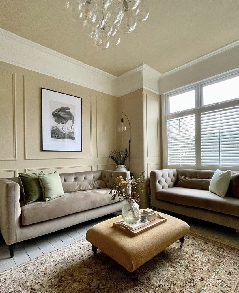
@_banks_ave

@home_is_elmleigh
Don’t have a different colour scheme in every room
Your home will feel more cohesive if the colours in each room have some connection to each other. You want the whole house to make sense as a whole. That doesn’t mean it all has to match, but do try to have some elements that link throughout.
Using harsh white light bulbs
Cold white light is unflattering to you and your interior! And it’s easily changed by swapping to a warm tone light bulb. Harsh overhead light flattens the colours and is the opposite of welcoming and relaxing. When considering your room, you want to create layers of lights, coming from different light sources, like a pendant light, with table lamps and a floor lamp for reading. This way you can adjust the light levels for cleaning, and for cosy nights in.

@thedailynest

@thedailynest
Don’t have a rug that floats!
A small rug marooned in the middle of your room will only make your room feel smaller as it draws your eye inwards. You want a rug as large as you can afford, to take up as much floor space as possible. It is the foundation piece in a room, and helps group items like chairs and a sofa together. Aim to have the front legs of the sofa and armchair on the rug to anchor it and stop it looking like that magic carpet, ready to fly away!
Take a look at this blog for more guidance on choosing the right size rug. Link to rug size blog.
@welcome_to_no.1

@myhomeincornwall
Don’t buy a matching sofa and chair set
One of the biggest mistakes we see is using too many matching pieces. It can be tempting when shopping to go with the whole matching set, confident in the knowledge that it all goes together. But once you get it home, it can make the room feel static and lifeless, and the furniture can feel blocky. Your eye wants to find interest and difference, to move around the room, and matching furniture doesn’t allow for this. Using a fabric that coordinates with your sofa on your armchair will make the room instantly feel more thought through and considered.
And don’t match your sofa and cushions
Although it may seem an easy decision in the shop, don’t put the matching cushions on the sofa! It adds nothing to the room and frankly can look a bit naff. However the right cushions can really finish the room, adding pattern, texture and colour. They can tie the whole scheme together, and make the different elements in the room work harmoniously. It really is worth binning the matching sofa cushions - or getting new cushion covers at least!!

@elleyhome
Want to discuss your options? Book a discovery call with us today!
Controversial, but don’t put your TV above the fireplace
We all love a good binge on a box set, and there’s no doubt that the TV deserves a place in our living rooms - but not as the main focal point in the room. Sometimes it is the only logical place for it, but if you can find any other place for it, then do. TV’s are pretty unattractive when they’re turned off, and giving them prime position leaves you with a big black rectangle on the wall. Plus the fact the mantlepiece is often too high for comfortable viewing and the problem with heat from the fireplace potentially damaging the TV, it really is best to look for another spot for the much loved TV.

@cb_loves_interiors_20

@thewestbankproject
Reconsider the accent wall
Accent walls have been around for a while now and were very popular as a way to add a pop of colour. In reality the use of a strong colour on one wall has the effect of bringing that wall towards you, and can make the space feel smaller and unbalanced. Instead consider taking the colour across more walls, or use a textured wallpaper to add colour and interest without shouting at you. Or if you are feeling brave, try colour blocking for an individual look with loads of personality.
For ideas on how to use colour blocking in your home, check out this blog. Link to colour blocking blog.

@elleyhome
Don’t hang your pictures too high or spread them out across the wall
This last mistake we see everywhere - in people’s homes, restaurants, hotels. When hanging art, you want it to correspond to what is around it. If it’s over a sofa, hang it in the middle of the sofa, not the middle of the wall. The same for a dining table; group the artwork with the table, rather than centre it on the wall. And the height of the picture needs to be just above your eye line, no higher. You should never have to look up to see a picture. If you have smaller pieces of artwork, group them together for more impact. Do not spread three small pictures out across the wall, instead bring them together as a group. And if you are after a gallery wall, think about how each image balances with the rest.

Want to know more about The Living House and how we can help you?