
Choosing the Best Pastel Paint Colours for Your Home
Written by Sophie Clemson
Adding colour to our homes is becoming increasingly popular, as we are seeing with our customers' choices. Using colour in your home can really add personality and using softer shades is a gentle way to add colour - and less scary if you’re more used to a neutral colour palette.
For many years now a pastel colour palette has been reserved for a child's bedroom or a traditional ‘feminine’ design. But we can see there has definitely been a shift in the colours people will consider. They aren’t so afraid to give it a go and try out the pastels. Afterall, it can always be painted over if you really don’t like it!
We aren’t just seeing the pastel tones in paint. Brands such as Loaf make beautiful sofas, in plaster pinks, sky blues and cucumber greens. This palette creates a sense of calm with the softness of the colour tones. But if you love to have more of a sharp contrast in your home, pastels are also great when paired with stronger and more vibrant colours too.
So maybe you’d love to go down the pastel colour route in your home but you’re feeling stuck knowing where to start? After staring aimlessly at all the paint charts, does it make you feel more confused which colour to choose?
Helpfully for you, we've put together a collection of our favourite pastel paint colours. Take a read and get ordering those samples!

Dulux, Tranquil Dawn - A soft and fresh colour, Tranquil Dawn was Dulux’s colour of the year 2020 and it's still just as popular today. It was inspired by the morning sky and sits between green, blue and grey. This colour works really well in a space where you want to have a relaxing and calming feel, with its subtle tones and freshness of colour. It pairs beautifully with neutrals or with more vibrant pops of colours if you prefer a bolder look. We really think it would look lovely in a home office, to create a tranquil atmosphere and working space. Colours really can change our mood and how we feel - perfect for a stress free working zone!

@tabsmaud

@mijnhuisje_

@littlehouseonourstreet
Little Greene, Bone China Blue Mid - A lighter shade of Bone China Blue, a colour based on Wedgwood china. Bone China Blue Mid is a grey blue shade which can provide a restful feel whilst having warm tones. It works brilliantly with a brighter white to create a contrast just like the Wedgwood designs. If you want to create a relaxing feel that doesn’t have a chilly feel like some other blue based paints, consider using Bone China Blue.
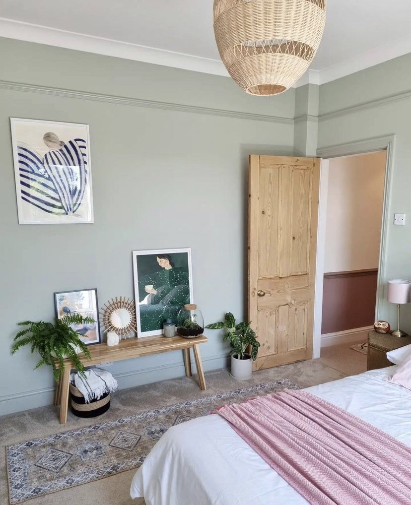
Little Greene, Green Stone - A neutral paint with a gentle green hue. If you usually opt for a neutral look, but would love to add a little more colour then Green Stone does just that. It pairs beautifully with whites but also with deeper greens such as rich sage shades. Add a pop of blush pink too if you like a bit of contrast.

@the_cottage_in_the_countryside
Dulux, Faded Damson - Dulux describe this as a sugary pastel shade. It has a purple hue without being a shade of lilac! It has grey undertones which help create a soft shade. It would work great in a bedroom when you would like a nod to purple whilst still having a gentle look. This colour sits well with Dulux’s Tranquil Dawn. They complement one another when used together in a colour blocking feature.
Farrow & Ball, Setting Plaster - Setting Plaster has increasingly grown in popularity. It really is a beautiful colour and was named after the blushing walls in newly plastered houses. Pink shades are no longer seen as just pretty colours, they are often an alternative to a neutral and this paint colour is just that. We are seeing dusty pinks appear in more than just bedrooms now. This colour works so well with greens, terracottas and especially with a bit of black! We particularly love seeing Setting Plaster when used in kitchens. If you have a neutral kitchen it adds colour without being overwhelming. It equally works beautifully with rich deep green kitchens too for an interesting contrast.
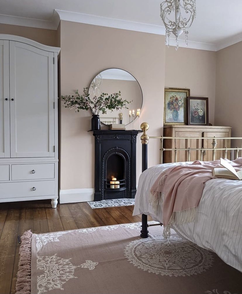
@elle_the_home_bird

@deco.dwelling
@at_the_merrells

@lauriestonliving
Dulux Blissful Blue - A colour to create a serene and tranquil feel whilst still adding a touch of calming colour - as the name suggests! We really love this colour paired with natural oak woods and white woodwork for a fresh feel. If you love using a mix of colours, it works great with yellows and pinks to create a more bold and fun look.
Lick, Yellow 01- This colour definitely creates a happy feeling, with its soft creamy yellow tones. If you love brighter colours this would definitely bring an energising feeling to your room. It would work really well with other pastel tones in accessories or perhaps a pop of teal, and it definitely sits harmoniously with a sharp white.

@lick
Looking for neutral paint colour options? Click here
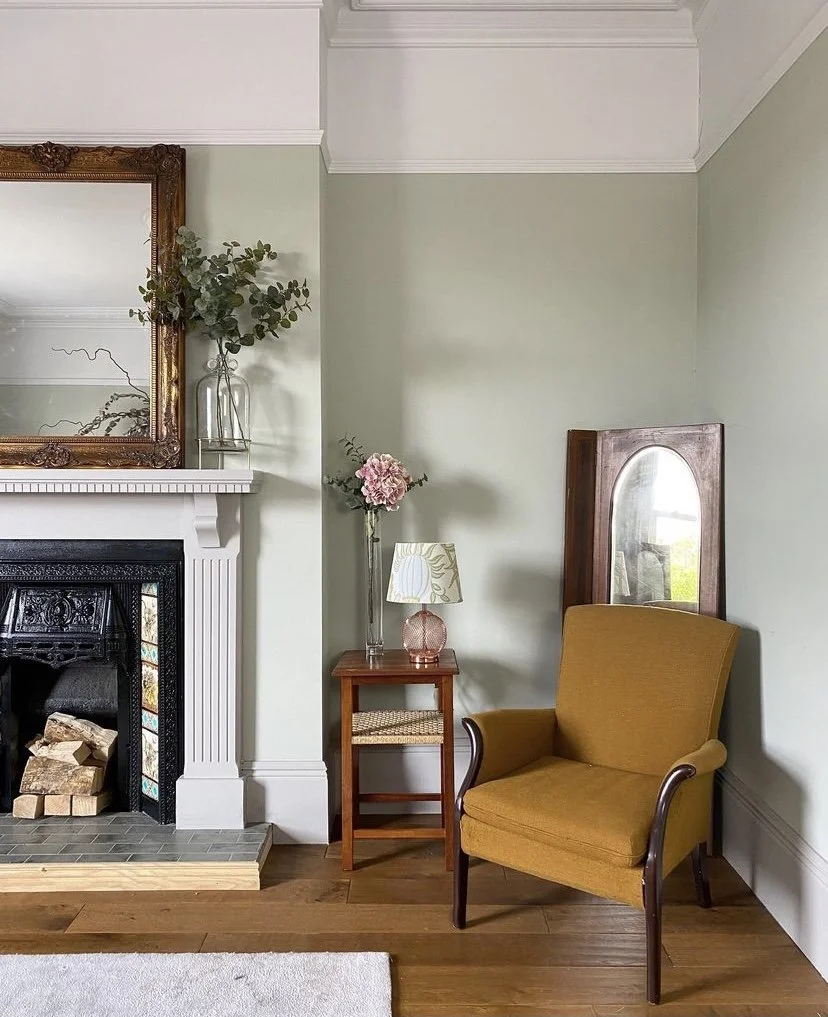
Farrow & Ball, Mizzle - Described as a soft grey green and named after the colour of west country skies where there is a mix of both mist and drizzle. Mizzle like many subtle pastel tones provides a soft and calming feel that has a hint of gentle colour without being too overpowering in the room. To create contrast it works well when paired with darker charcoal greys or black accents such as lighting and accessories. This colour works perfectly in a living room to create a restful and relaxing atmosphere.

@zoeoliviaev
@ohmyedwardian
@victoria_road_restoration
We always recommend getting a tester pot of the paint before you make your decision. It really is worth it, no matter how much of a hurry you may be in, as paints can look so different in the light of our homes compared to the small chip on the paint chart. Paint onto a piece of lining paper so you can move the piece around the room at different times of the day to see how it appears in the natural light.
If you have any questions about using colour in your home, get in touch! We’d love to hear from you, and can offer you personalised help and advice.